
A vintage garage logo is automotive branding built from the visual language of 1950s–1970s service stations and repair shops.
The style only reads as authentic when restraint governs every choice; pile on racing flags, checkered borders, and dated slogans simultaneously, and the mark collapses into pastiche.
One strong type treatment, a single classic car silhouette, and a muted palette of cream, deep red, and oxidized gold against weathered white will always outperform the cluttered alternative.
Retro Automotive Logos

A vintage garage logo built in the retro automotive style pulls directly from the gas station and repair shop signage you’d see along Route 66 between the 1950s and 1970s.
The silhouette is usually the anchor: a low-slung roadster, a finned sedan, or a muscular early pony car in profile, stripped to its most recognizable outline.
Speed lines trailing behind the rear wheels suggest motion even when the car is parked on the sign, and the typography matters as much as the image.
I reach for slab serifs, condensed scripts, or tall sans-serifs that were actually cast in metal or painted by hand during that era, not digital fonts that merely approximate the look.
Period-correct color palettes lean toward cream, deep red, navy, and oxidized gold against matte black or weathered white backgrounds.
The finish should read like enamel that has baked in the sun for thirty years, not like a fresh screen print. Where this style can go wrong is piling on too many era markers at once.
A single classic car shape, one strong type treatment, and a restrained palette will read as authentic. Add racing flags, a checkered border, and a dated slogan simultaneously, and the logo collapses into pastiche.
I would pick a 1960s coupe silhouette with a single horizontal speed line and a bold condensed wordmark every time; it communicates the garage’s specialty without shouting.

Officially Licensed Disney Pixar Cars Apparel For Women - Men - Girls - Boys - Toddler; Disney T-Shirt; Pixar T-Shirt; Vintage Poster; Racing; Legend; Lightning McQueen T-Shirt; Fun; Vintage; Christmas; Seasonal; Holiday; Smokey's Garage;

Showcases a detailed collection of vintage inspired classic cars. Rich distressed textures and bold automotive illustration create a strong garage culture look for true muscle car fans and retro vehicle collectors.

Official Licensed Gas Monkey Gear
Classic Car Logos
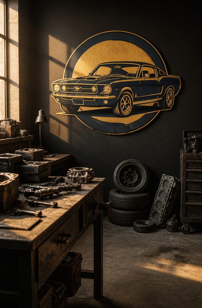
A vintage garage logo built around a specific model carries more weight than generic retro wheels or checkered flags.
Muscle cars, hot rods, and classic trucks each signal a different kind of shop or collector, and the choice of vehicle matters as much as the lettering style.
The 1960s muscle car era produced the icons that still dominate garage culture.
The Jaguar E-Type Series One, with its 265HP inline-six and unmistakable long-hood silhouette, shows up in places like the Retro Garage game community because the shape reads instantly even in simplified form.
Owners on Reddit mention it as "the most beautiful car in existence," which is exactly the reaction a logo wants.
The Ford Mustang, Chevrolet Camaro, and Dodge Charger work the same way: their proportions are dramatic enough to silhouette, and their grille or taillight details identify the era without needing a full rendering.
Hot rods and pre-war trucks appeal to a different builder.
A 1932 Ford coupe or a slammed Apache pickup suggests hands-on fabrication rather than restoration, and the logo can lean into exposed engines, bobbed frames, or patina finishes that would look wrong on a muscle car badge.
The split here is between preservation culture and built-not-bought identity, and the vehicle choice makes that distinction before the typography even starts.

【Racing Car Metal Sign】8 x 12 inch metal tin signs with vintage patterns are perfect for bringing a nostalgic touch to your garage,man cave,cars room,shop, gas station and other wall decorations.

[Playful Retro Garage Decor] — Featuring the humorous “Easily Distracted by Women” message alongside a vintage automotive scene, this sign brings personality and nostalgia to garages, workshops, and automotive spaces.

【6-Piece Vintage Garage Sign Set】Create a complete retro garage wall display with this 6-piece vintage tin sign set. Each sign features a different automotive-inspired design, including car service, gas station, tool shop, hot rod, mechanic, and old garage themes for a coordinated decorative look.
Vintage Badge Logos

A vintage garage logo built as a badge sits inside a circle or a shield, almost always ringed with fine parallel lines that read as ribbed metal when you shrink it to a business card.
That border does heavy lifting: it frames whatever sits in the center and tells the eye this mark was stamped, not drawn freehand.
The center usually holds a piston, a wheel, a wing, or the shop’s founding year, while a banner across the middle or curled along the curve carries the name in compact lettering.
This format borrows from auto marques, brewery labels, and fire department patches, which is exactly why it works for garages. The associations are already baked in: durability, hand work, an era when things were repaired instead of replaced.
I would reach for a badge when the shop does restoration, custom builds, or anything where the customer needs to trust the craft before they hand over the keys.
You lose some flexibility with this style. A tall shield or wide circle demands a layout that fits, and squeezing a long shop name into that arc turns cramped fast.
I would keep the word count low, use the banner for the name and the border for the city or established date, and never try to explain the whole business inside the badge itself. That is what letterhead is for.


Typography-Focused Logos

Scripts that mimic hand-painted sign lettering carry a vintage garage logo better than almost any illustration. The stroke weight varies naturally, the baseline shifts slightly, and the whole thing reads as someone cared enough to do it by hand.
I look for type families like Sign Painter or Lobster when the shop wants that roadside-garage feel, though I temper the flourish. Too much curl and it drifts into wedding-invitation territory.
Slab serifs are the other backbone of this look, and they pull from a different source entirely: old machinery plates, cast-iron stamps, factory labels.
Clarendon and Rockwell are the names that come up, and they work because the heavy rectangular serifs read as durable even at small sizes.
A logo set in Clarendon Bold with a simple border around it needs no car icon to say automotive.
Distressing is where I get cautious. Aged texture can sell the vintage claim or betray it as fake, and the line sits in how systematic the wear looks.
Real paint flakes randomly; digital distress too often repeats. I prefer working with actual scanned textures or limiting the effect to edges only.
A light touch on one element beats heavy weathering across the whole wordmark. The best vintage garage logos let the letterform do the aging, not a filter slapped on top.

PREMIUM FABRIC:Made of high-quality soft cotton fabric, lightweight and breathable, keeps you dry and comfortable all day long without stuffiness

【6-Piece Gas Station Sign Set】Create a complete retro garage wall display with this 6-piece vintage tin sign set. Each sign features a different automotive-inspired design, including car service, gas station, tool shop, hot rod, mechanic, and old garage themes for a coordinated decorative look.

Minimalist Vintage Logos

A stripped-down vintage garage logo keeps its period feel through proportion and restraint rather than ornament. Two colors, sometimes one, with line weights that reference mid-century sign painting without copying every flourish.
The period character lives in the oval proportions, the slight slant of a wordmark, the negative space around a piston or wing that has been reduced to its silhouette.
The contrast with busier vintage styles is immediate. A full-badge logo with ribbon banners, gear teeth, and distressed texture can read authentic in a large format, but at small sizes or on a uniform patch it collapses into noise.
Minimalist versions solve that by deciding what matters most. Usually that means the name and one symbol, locked together with spacing that feels intentional.
This approach fits best when the application demands flexibility. Business cards, social media avatars, embroidered work shirts, and vehicle door decals all punish complexity.
A shop that does restoration work and wants the logo to feel credible without shouting "theme restaurant" wins here. This style tends to feel colder than richer vintage looks.
A minimal logo can feel cold if the proportions are too modern or the type choice drifts toward generic sans-serif. The restraint has to be deliberate, not lazy.

Distressed auto-parts logo recreates a vintage Sandusky, Ohio garage look

Distressed auto-parts logo recreates a vintage Sandusky, Ohio garage look

Distressed auto-parts logo recreates a vintage Sandusky, Ohio garage look
Illustrated Logos

Hand-illustrated or vector-illustrated vintage garage logo work carries a weight that template fonts and clip art never match.
A drawn piston, a period-correct torque wrench, or the interior of a 1950s service bay rendered in crosshatch or two-tone screen printing tells the viewer someone cared enough to commission the thing.
The investment stings. A competent illustrator with automotive knowledge will need time to research period details, rough thumbnails, and execute final art.
Budget two to four weeks and several hundred dollars minimum for anything you will not later want to redraw yourself in a panic.
Vector illustration softens the blow slightly. The same drawn look scales cleanly from business card to garage banner without the pixelation of raster art, and revisions come cheaper when lines are editable points rather than erased graphite.
Still, the upfront cost separates this route from template services that deliver in 48 hours for under fifty dollars.
I would spring for custom illustration only if the logo will front a real shop with physical signage, or if the collector plans to use it across years of merchandise and show displays.
For a one-off event or a social media page that might rebrand in six months, the premium is hard to justify. Permanence fights speed here: buy the illustration when the identity is settled, not while you are still testing names.

Metal Sign: This metal decorative logo adopts a retro color design, with clear fonts and patterns that are not easily faded. Measures about 20cm/7.9 inch wide, 30cm/12 inch long

A great collection of reproduced vintage gas oil tin signs; 35 pieces in total, these metal signs are the epitome of American pop art - the beauty, the nostalgia, the passion of the artist-they are truly American classics;

Premium Quality:Racing Fuel tin signs are made of high quality tin.These signs are not easy to bend,will not rust and fade.It is environmentally friendly and recyclable.
Monogram Logos

Interlocking initials carry the same weight old car club insignia did on a member’s jacket or valve cover, and that association is why a monogram vintage garage logo still reads authentic today.
The best ones lock two or three letters into a single form, usually inside a diamond or oval border that contains the shape the way a timing cover contains gears.
Diamond frames tilt the letters onto their corners, which forces the eye to work a little harder and gives the mark the feel of something earned rather than bought.
Ovals soften the same idea for shops that service classics rather than race them.
The letter treatment matters as much as the container: slab serifs with slight flaring at the terminals borrow from 1950s speed equipment branding, while thinner stroke weights with subtle bracketing pull from earlier coachbuilder plaques.
Where this goes wrong is over-elaboration.
A monogram that needs three colors to read as two letters has failed its job. The interlock should solve itself in black and white, at small scale, because it will be stamped on tool chests and embroidered on shop coats.
I would pick a two-letter lockup for any shop starting out; three letters only work when at least one has a natural horizontal bar to anchor the others, like an H or a T crossing the junction.
Skip monogram generators that promise vintage styling with a click. The spacing between interlocked letters is too specific to automate well, and the dead giveaway is always the negative space where the forms meet.

[Size - 3"] - Vibrant colors: Bursting with life, these stickers showcase an array of captivating hues that catch eyes and ignite excitement.


Funny Style: The old man special edition car emblem adds a humorous custom look to cars, trucks, SUVs, and other vehicles with a clean chrome silver and black finish
Emblem Logos

Emblem logos sit heavier on the page than badge logos, and the difference matters when you are deciding how your vintage garage logo will live across surfaces.
Where a badge stays relatively flat, an emblem pushes into three dimensions: cast-metal bevels, ribbon scrolls curling behind the main shape, layered plates that read as enamel or stamped steel. That depth is the appeal, and also the problem.
For print, metallic effects and fine gradients reproduce cleanly on a good press or a vinyl cutter with spot colors.
On screen, those same effects flatten or band if the file is not prepared at high resolution with the right color profile.
I have seen garage owners commission beautiful emblem work, then watch it turn muddy on their website header because the designer delivered one raster file at 72 dpi.
Ask for vector source files and a simplified one-color version before you pay the final invoice. The one-color version will save you on merchandise runs, vehicle wraps, and anywhere the full metallic treatment is not practical.
You do pay something for this.
Emblems carry authority, but they demand more attention to reproduction than a simpler badge or wordmark. If your shop does mostly digital advertising and quick-turn stickers, the extra production care may not be worth the visual weight.
If you are painting a building sign or running a restoration shop where customers expect craft, the dimensional detail pays for itself.

PREMIUM CANVAS WITH VIBRANT PRINTING – Crafted from high-quality artist-grade canvas and printed with fade‑resistant inks, our artwork delivers sharp details, rich colors, and a true painted look that stays beautiful for years.
PREMIUM CANVAS WITH VIBRANT PRINTING – Crafted from high-quality artist-grade canvas and printed with fade‑resistant inks, our artwork delivers sharp details, rich colors, and a true painted look that stays beautiful for years.
PREMIUM CANVAS WITH VIBRANT PRINTING – Crafted from high-quality artist-grade canvas and printed with fade‑resistant inks, our artwork delivers sharp details, rich colors, and a true painted look that stays beautiful for years.
Grunge Style Logos
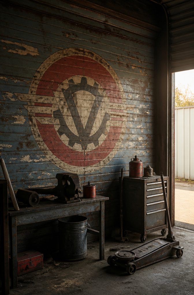
Simulated rust, peeling paint, and cracked ink are the visual language of grunge style logos, but the technique only works when the distressing reads as intentional rather than accidental.
The best versions layer vector textures over clean typography so the underlying structure stays legible; the worst look like someone ran a filter once and called it finished.
What separates convincing grunge from overused template work is control over where the wear lands.
Authentic aging happens at stress points, edges where hands grip, surfaces that face the weather. Randomized distress across the whole mark ignores that logic and reads as noise.
I would place simulated rust around bolt holes and seams, keep the main letterforms cleaner than the border, and never let the texture obscure a letter to the point of guessing.
Aged paper backgrounds can ground a vintage garage logo, though I think they fail more often than they succeed.
Keep the effect boxed in: use it as a contained badge shape, not a full-bleed texture that competes with every other element.
Cracked ink works best at small scale on business cards and shirt tags, where the detail rewards close inspection, but it tends to disappear or muddy at distance on a shop sign.
For that reason, I would design the core mark to read clean at 10 feet, then add the grunge layer for applications where people will study it up close.
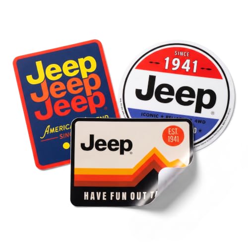
Classic 3-pack featuring American Legend Since 1941, Guaranteed Since 1941, and Have Fun Out There designs
Officially Licensed Carroll Shelby Merch: A distressed vintage style print of the Shelby CS racing logo with a checkered flag accent, capturing the worn look of a well used trackside decal on a graphic tee

Features a retro style pinup girl sitting on pistons with checkered flags for mechanics and gearheads who love classic American muscle car culture.
3D Logos

Dimensional vintage garage logos with bevels, drop shadows, and chrome effects look impressive on a large sign above a bay door, where the simulated depth catches actual light and the metallic finishes read as metal rather than pixels.
These treatments fail on small digital formats, where the same effects collapse into muddy stripes and the detail that sells the look at 24 inches becomes illegible at one.
Embroidery is another dead end; the gradients and fine shadows that make chrome read as chrome simply do not survive the translation to thread count.
I would use dimensional effects for merchandise that stays large, like back patches or metal signage, and strip them back to flat color for anything that shrinks.
You do pay something for this: a logo that looked built in 1957 usually looked built in 1957 because it was cast or painted on a surface with actual depth, and faking that depth digitally costs you flexibility where most people will actually see it.

Made from a LARGE 12" X 18" inch white powdercoated metal sign blank


Man Cave Decor SIZE:5 pces Vintage Man Cave Metal Tin Signs 8" WX 12" L
Hand-Drawn Logos

A genuinely hand-lettered vintage garage logo carries irregularities no filter reproduces: wavering stroke weight, ink pooling at terminals, and letterforms that sit slightly off the baseline.
These marks signal human decision, not algorithmic noise. Distressed digital approximations scatter identical grit across every curve; the eye reads the repetition as flat.
Commissioning starts with finding a lettering artist whose sketchbook shows automotive or industrial work, not just wedding invitations.
Expect to pay roughly $400–$800 for a single primary wordmark with one round of revisions, more if you need alternate layouts for signage and merchandise.
The process typically runs two to three weeks: rough pencil sketches, inked finals, then digital delivery in vector format.
The irregularities worth preserving are the ones that serve readability. A stroke that thickens unexpectedly on a descender adds character; one that obliterates a counter makes the word illegible at distance.
I would always ask the artist to deliver both the authentic inked version and a subtly cleaned variant for small-scale use. The raw version wins on shop signage and T-shirts; the refined one keeps your business card from looking muddy.
Trade-offs are real.
Hand-drawn work costs more and scales slower than template logos. For a one-person shop building its first identity, the investment only makes sense if the logo will appear on physical surfaces where human imperfection reads as craft, not error.
Geometric Logos

Chevrons, diamonds, and radiating lines give a vintage garage logo immediate period credibility because they pull straight from the 1930s–1950s streamline aesthetic.
Art deco geometry showed up everywhere from gas station signage to service station uniforms, and the same visual shorthand still reads as mechanical precision today.
I look for simplified forms that suggest motion without actually depicting it: a diamond framing the shop name, parallel lines that taper like speed streaks, or a sunburst radiating from behind a central badge.
Mid-century modern influence softens the deco severity just slightly. Where pure art deco goes heavy on gold and black symmetry, the garage application usually loosens up with wider spacing and cleaner negative space.
The radiating lines become fewer and bolder; the chevrons flatten out into simple arrows or roofline shapes that hint at a garage bay.
You trade recognizability for originality, or vice versa. These forms are so tied to the era that they can feel generic if the execution is too careful.
I would push the geometry harder than expected: overlap the shapes, let lines extend past the frame, or pick one unexpected color that breaks from the expected cream-and-burgundy palette.
A geometric vintage garage logo works best when it looks like it could have been painted on a 1940s delivery van, not like it was designed in 2024 to look like one.
Art Deco Logos
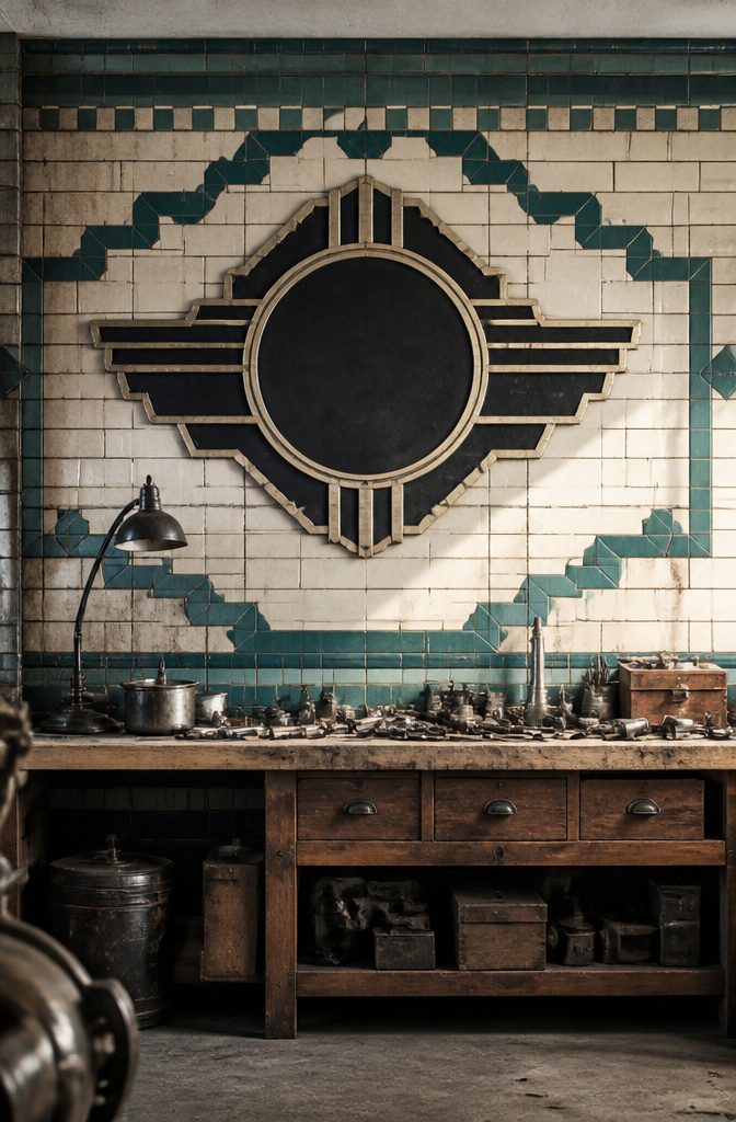
Art Deco sits tighter to the 1920s and 1930s than general geometric styling, and that period specificity is what separates a convincing vintage garage logo from a generic retro badge.
The stepped forms, sunburst motifs, and vertical emphasis all arrive from the same era, and they read as deliberate references rather than vague nostalgia.
Broadway or similar condensed, high-contrast typefaces carry that vertical thrust without needing extra ornament. I would pair them with a stepped border or a single radiating sunburst behind the garage name, not both.
The stepped forms work best framing the text; sunbursts behind an icon like a piston or wheel hub feel more balanced than sunbursts behind lettering alone.
Small sizes can blur the fine lines. Those thin horizontal strokes in Broadway-style faces can disappear on a business card or Instagram avatar.
If the logo needs to work embroidered on a shop shirt, I would thicken the weight or lose the sunburst entirely and let the stepped geometry do the period work.
Customization Options
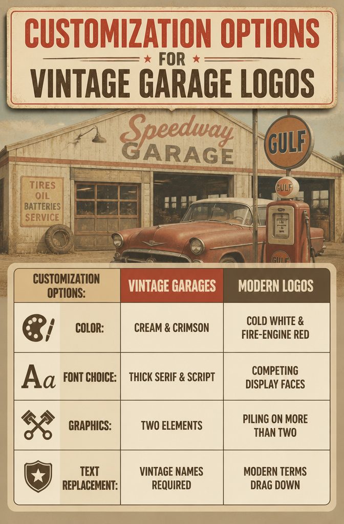
A vintage garage logo loosens up or tightens its era feel through four levers, and color is the one most people overshoot first.
A cream-and-crimson palette with soft yellowing reads 1950s gas station; swap the cream for cold white and bump the red to pure fire-engine, and the same layout turns modern sport brand.
I would keep saturation down by 20-30 percent from what the template shows, because the fade is what sells the age.
Font choice runs on a similar sliding scale. Serif scripts and condensed sans serifs both period-match, but mixing them wrong collapses the illusion.
A thick slab serif for the main wordmark with a thin script underneath stays coherent; two competing display faces fight for attention and read as clip art.
Graphics follow the same rule of restraint. Crossed pistons, winged wheels, and shield backdrops all exist in template libraries, but piling on more than two elements turns heritage into parody.
Most platforms let you swap in your own illustration, which is worth doing if you have a specific car silhouette or shop mascot, though a custom graphic pushed too clean against distressed type creates a jarring mismatch.
Text replacement is where personalization usually stops being vintage. A garage name with "Automotive" or "Speed" in it period-fits naturally; "Tech" or "Solutions" drags the whole mark forward regardless of the rust texture layered on top.
I would write the name out in a plain document first, and if the word itself feels wrong in 1962, no amount of patina saves it.
The limit sits there: you can change colors, fonts, and imagery freely, but the vocabulary of the business name is harder to fix once chosen.
Usage Rights and Licensing

Personal use of a vintage garage logo keeps you safe for a hobby project or a one-off shirt, but the moment you print business cards, signage, or merchandise for sale, you have crossed into commercial territory.
Subscription libraries like Creative Fabrica handle this distinction with a single license tier that covers both, which is where the €3.99 monthly plan becomes relevant.
That rate, down from €29.00, opens access to roughly 13 million graphics, fonts, and templates with personal, commercial, and print-on-demand use all bundled together.
For a shop owner building out branded workwear, decals, and social assets, the math is straightforward: one month of downloads at that price often costs less than a single commissioned illustration elsewhere.
The catch with any stock library is that you do not own the files outright.
Stop paying and the license to use new downloads ends, though work you already published generally stays covered. Hiring a designer is the only path that transfers full rights, and even then you need a written agreement saying so.
Without it, the creator typically retains the copyright and you hold only a usage license, which is a distinction that matters if you ever plan to trademark the logo or sell merchandise through third-party retailers.
For most small automotive shops, the subscription model wins on speed and budget; buyout rights only become worth the premium when the business itself has scale.
Design Tools and Platforms

Template-based generators and full design software sit at opposite ends of the same job, and the choice between them depends on how much control you actually need over your vintage garage logo.
Generators like Canva or VistaPrint pull from pre-built vintage badge layouts, distressed textures, and retro typefaces that already read automotive.
The work shrinks to swapping text, picking a color palette, and downloading a PNG in an afternoon. That speed is the point for a weekend project.
Full software, Adobe Illustrator or Affinity Designer, hands you vector paths, custom kerning, and the ability to build a logo from a scanned oil can label or hand-lettered shop sign.
The learning curve is real. I would not recommend it for a one-off garage sign unless you already know the tools or plan to iterate a lot.
You trade flexibility for finish, or the other way around. Generators give you a polished result fast, but you will see the same chevron graphic on three other shops in your county.
Full software lets you avoid that sameness, yet the time investment only pays off if the logo becomes signage, merchandise, and business cards over years.
For most home garage builds or small collector spaces, a clean template with customized type wins.
The logo lives on a banner above the lift or a jacket patch, not a national brand system, and the generator output holds up fine at that scale.
Color Palettes That Read Vintage

Cream and red is the pairing most people picture first, and for good reason: it reads 1950s service station without trying hard.
The cream keeps the red from looking aggressive, and the red keeps the cream from looking like a kitchen appliance. I would use this for a shop that wants to feel approachable, not precious.
Black and gold carries more weight. It suggests the 1920s and 1930s, the era of hand-painted coachlines and formal garage signage.
The risk is looking like a liquor label or a casino chip. I would skip it unless the logo has real detail to justify the formality, because flat color blocks in black and gold tend to read cheap.
Petrol blue and white is the most versatile of the four.
It nods to 1960s racing liveries without quoting them directly, and it photographs well on both light and dark backgrounds. I have seen this combination age better than trendier choices because it avoids the obvious.
Faded orange and brown is the most specific. It signals 1970s dirt-track and hot-rod culture, and it works when the shop actually has that personality.
The downside is narrow appeal: this palette can look dated in a way that cream and red somehow avoids. I would use it only when the owner already lives that aesthetic, not as a costume.
Frequently Asked Questions
What styles are popular for vintage garage logos?
Popular styles include retro automotive logos with Route 66-era silhouettes and speed lines, classic car logos built around specific muscle cars or hot rods, vintage badge logos with circular or shield borders, typography-focused logos using hand-painted scripts or slab serifs, and minimalist versions that keep period feel through proportion and restraint.
Are there customizable options available for vintage garage logos?
Yes, you can adjust color saturation down 20-30 percent from template defaults to sell the aged look, swap fonts between serif scripts and condensed sans serifs but avoid mixing competing display faces, and replace graphics with your own car silhouette or shop mascot.
The business name itself is harder to fix: words like ‘Tech’ or ‘Solutions’ drag the mark forward regardless of rust texture.
What was the old Chrysler logo?
It focuses on creating original vintage garage logos rather than analyzing historical manufacturer emblems.