
I recommend decorating just two or three walls and leaving the others completely blank. Negative space makes your decorated walls pop more, and your room feels bigger and calmer.
Pick your largest wall for a bold 36×48″ canvas or gallery cluster, keep narrow walls empty, and balance a statement piece with a smaller arrangement elsewhere.
This approach ensures your space looks expensive and intentional, not cluttered.
How Many Walls Should You Actually Decorate?
I used to think every wall needed something. I’d hang wall art everywhere and wonder why my room felt chaotic. Negative space actually improves a room’s feel.
I pick 2-3 walls max and leave the others blank. This creates balance that lets your eyes rest. I consider visual weight too. My biggest wall gets a 36×48″ canvas or a gallery arrangement, but my narrow wall stays empty. It provides a visual pause.
When I’ve got busy furniture or odd windows, I don’t force decorations. I step back and assess the flow. Your room feels bigger and calmer when not every surface demands attention. Restraint in decoration produces better results than filling every available space.

Vintage Twin Trees Sketch Wall Art: This hanging canvas artwork features elegant twin trees in classic etching style. Delicate linework, soft sepia tones, and layered textures capture the timeless beauty of botanical illustration

100% COTTON CANVAS: Cotton Makes the Ideal Art Surface. It is made of cotton without rinsed with any alkaline chemicals, it keeps the natural tone and the fiber flexibility of the cotton yarns with high tension strength, so brushes just glide right over them and make painting effortless.

Vintage Kitchen Style: A classic chef themed still life with plaid pattern and food inspired detail brings a warm, traditional feel - printed on stretched canvas with crisp image clarity.
How to Choose Your Room’s Focal Wall
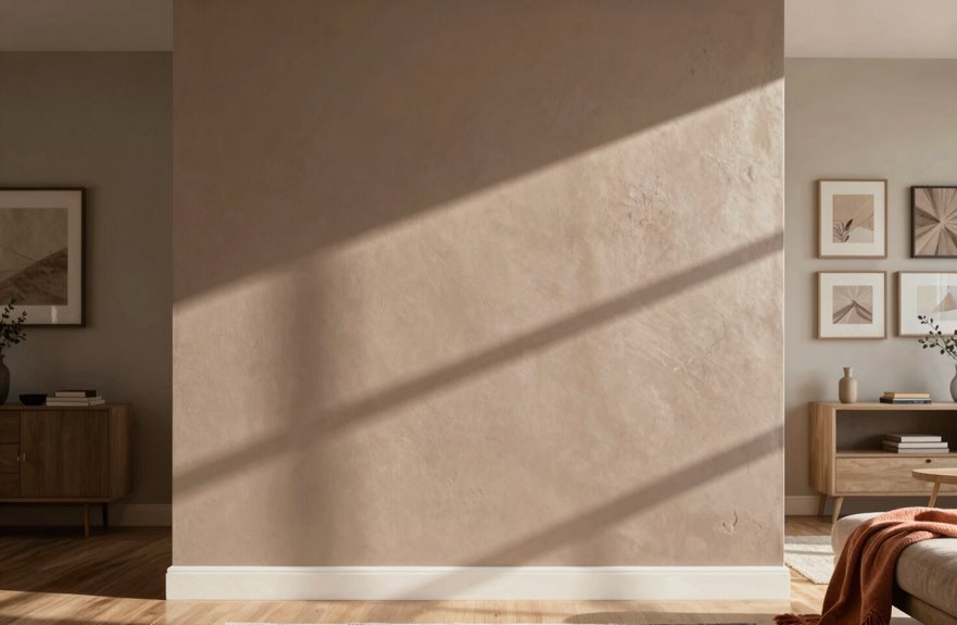
Where exactly do you want everyone’s eyes to land when they walk into your room? That’s your focal wall. Start by checking what the room gives you. Maybe there’s a fireplace, a big window, or just one wall that’s begging for attention.
Pick one wall for something bold, like a huge canvas or a cool diptych. Then balance it out by putting a gallery wall on another wall so your eyes travel around. Avoid going overboard on every single surface. Negative space is important; those blank walls let your couch and lamp actually stand out.
For long rooms, split the space into zones so each area feels cozy. If one side feels heavy with windows or doors, lighten up the opposite side with higher placements.

Versatile Sizes for Display: Vittanly 15-Pack Multi-Size Picture Frame Set includes 3x 8x10", 6x 5x7", and 6x 4x6" frames. Ideal for showcasing family photos, artwork in living rooms, bedrooms, and offices

MULTIPLE FRAMES COLLAGE: Bulk of 5 pieces picture frames set in the same sizes. Perfect for pictures 8x10 with mat or 11x14 without mat. The frame opening display size will be 0.5 in smaller than the photo to hold the photo in place

Versatile Sizes for Display: Vittanly 20-Pack multi-size picture frame set includes 4x 8x10", 8x 5x7", and 8x 4x6" frames. Ideal for showcasing family photos, artwork in living rooms, bedrooms, and offices
How to Size Wall Decor for Small, Medium, and Large Walls
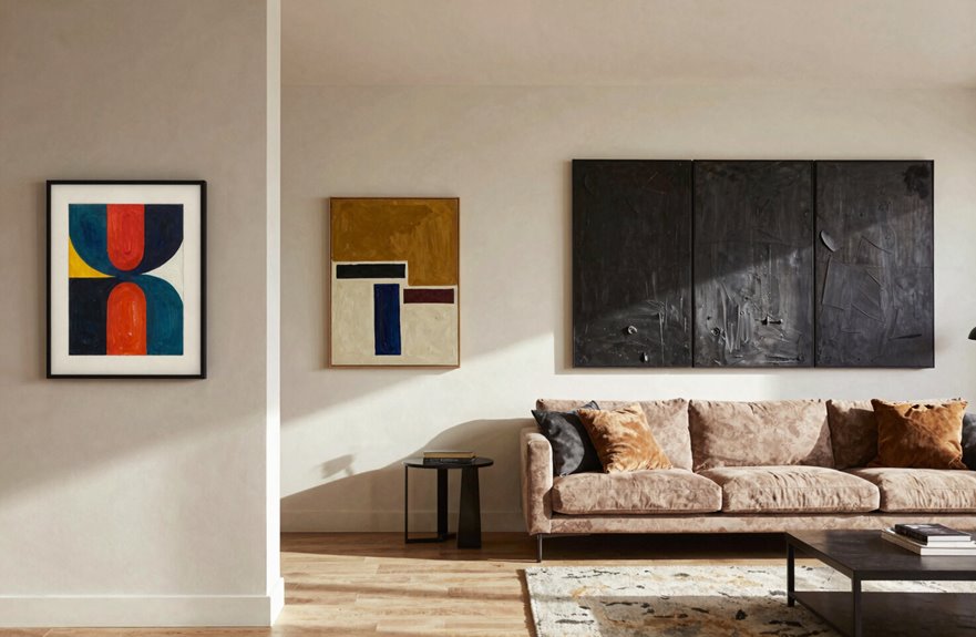
How do you know if that painting you love will actually fit your wall or totally overwhelm it? Getting wall decor sizing right transforms your space from chaotic to cozy.
For small walls (24 inches or less), less is often more. Skip decor entirely or go super minimal. Leaving breathing room is a valid design choice.
Your medium walls are where combining one bold focal piece (think 16×20 inches) with smaller supporting frames works best. This mix of wall scale keeps things interesting without overwhelming the space.
For large walls, choose a single 36×48 inch statement piece or a substantial gallery arrangement. These command attention properly and prevent the wall from feeling empty.
Measure your wall width first, then check viewing distance and nearby features for room balance that reflects your personal style.

Modern Abstract Floral Wall Art Set of 2: This two-piece framed wall art set showcases abstract floral designs that blend delicate flower forms with layered graphic elements. The balanced composition allows the artwork to function as a cohesive pair or as individual statement pieces.
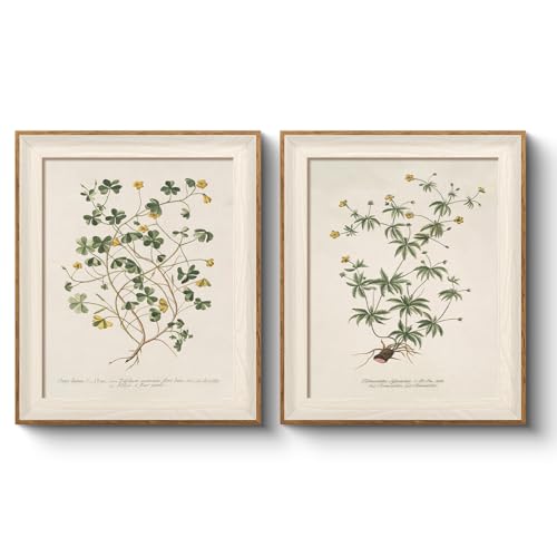
[VINTAGE BOTANICAL ELEGANCE] Features two meticulously detailed monochrome botanical sketches on a creamy neutral background. The delicate leaf and branch textures create a serene, timeless aesthetic where the two panels perfectly complement each other to form a sophisticated diptych display.

Concentric Discs & Mirrors: Features 2 openwork gold iron panels with 3D embossed concentric ripple plates and reflective circular mirror inserts that bounce ambient light for radiant luxury
How to Balance Decor Across Multiple Walls
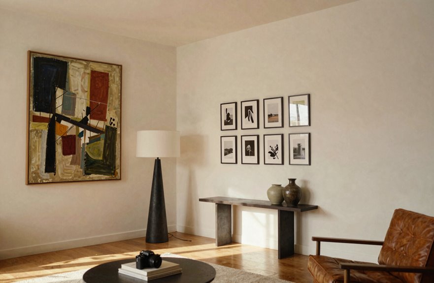
Once you’ve nailed the sizing for each wall, the real fun starts: figuring out how to make them all work together without your room looking like a chaotic art explosion. Think of it as a conversation between walls, where some speak up and others whisper.
Here’s how to balance your spaces:
| Wall Type | My Go-To Move |
|---|---|
| Entry wall | One big statement piece, 36″ wide |
| Adjacent wall | Gallery wall with 5-7 frames |
| Opposite wall | NOTHING—pure negative space |
| Far corner | Floating shelf with small plant |
| Behind sofa | Horizontal triptych, 60″ total |
Never decorate all four walls. That’s too much. Instead, create rhythm by varying your composition. If your fireplace wall feels heavy, balance it with a single large mirror across the room. The negative space is where your eye rests and where your room can breathe.
Balance isn’t about matching. It’s about creating visual harmony through intentional spacing and restraint.

Package Content: this package comes with 5 pieces of moon phase wall hanging decors, including crescent moon shapes, eclipse moon shapes and round moon shape, sufficient quantity and various styles for your different decorative works

【Unique Boho Wall Decor Set】This indoor plant wooden wall planters set includes 2 handcrafted wall vase paired with faux pampas grass and eucalyptus leaves, perfectly blending farmhouse, modern, minimalist, bohemian, and rustic styles to add personality to any space. These hanging planters are perfect as living room wall art, bathroom wall decor, dining room wall art, even entryway wall decor, injecting a touch of bohemian flair

Boho Aesthetic - Enhance your home with this 3-piece black abstract bohemian wall art set. Perfectly designed for bedrooms, living rooms, and kitchens, these framed canvas prints add a chic minimalist and boho-inspired touch
How to Mix Art, Mirrors, and 3D Objects
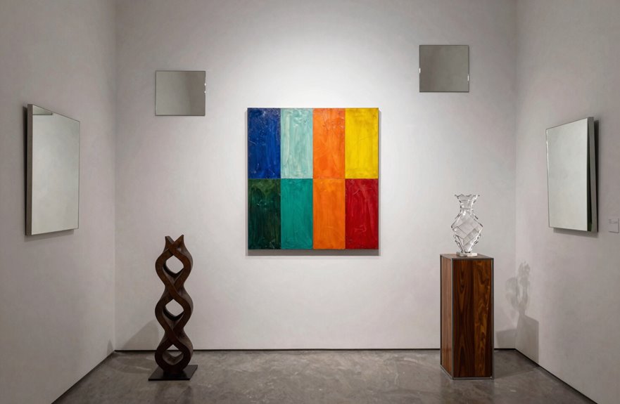
I love mixing things up on my walls with art, mirrors, and 3D objects together. Start with your largest piece, like a 36-inch round mirror or a bold canvas, and then layer in smaller textures. I hang woven wall baskets or metal sculptures about 6-8 inches away from framed prints so everything pops without fighting, and I keep my color palette tight, maybe 3 shades max, so it feels intentional, not chaotic. This approach creates a room that feels lived-in and visually balanced.

Floater Frame for 36x48” Stretched Artwork - This metal floating frame is especially designed to fit your 36x48” canvas painting. Rabbet depth: 1.5 inch, the art frame will work well with your 1-1.5 inch depth gallery wrapped canvas artwork. Reserved 0.2” gap creates a floating effect for beautiful art. 【The listed frame size is based on inner dimensions. Please make sure your desired artwork display size before ordering.】

Floater Frame for 36x48” Stretched Artwork - This metal floating frame is especially designed to fit your 36x48” canvas painting. Rabbet depth: 1.5 inch, the art frame will work well with your 1-1.5 inch depth gallery wrapped canvas artwork. Reserved 0.2” gap creates a floating effect for beautiful art. 【The listed frame size is based on inner dimensions. Please make sure your desired artwork display size before ordering.】

Dimensions: This picture frame is suitable for paintings measuring 36x48 inches,the overall frame size is 36.2x48.2 inches.
Combining Textures Creatively
Why settle for flat and boring walls when you can mix things up and make them stand out. Playing with wall textures makes a room feel personal to you.
Start with mixed materials: think wood, metal, and ceramics together. Pair a 24-inch metal sunburst mirror with a soft fabric wall hanging. The contrast creates visual interest.
Gallery clusters work well for displaying collections. Group small baskets and framed prints about 2 inches apart to create a collected vibe. Try three ceramic plates (10-12 inches each) above your sofa with one small wooden sculpture off to the side.
For wall balance, anchor big pieces on primary walls and place smaller treasures elsewhere. A 36-inch leaning ladder with woven throws adds depth without clutter.
Keep your colors cohesive, and your arrangement will succeed.
Balancing Mixed Elements
So you’ve got your walls picked out, but now you’re staring at a mix of art, mirrors, and that weird ceramic cat you love. How do you make it all work together without it looking like a garage sale exploded?
Spread mixed elements across different walls to keep things interesting. Avoid matching setups next to each other. Pair a large canvas like the 36″x48″ IKEA HILMA with smaller pieces on adjacent walls.
Balance matters. Include at least one 3D object per wall cluster, such as a brass sconce or ceramic sculpture, so every grouping has depth. For mirrors, group three smaller ones (try 12″x16″ ovals) instead of identical pairs.
Watch your visual weight. Coordinate warm tones and raw textures across pieces so the room feels cohesive rather than chaotic.
How to Create Flow Between Adjacent Walls
Creating visual continuity between two walls requires varying your wall decor so the eye travels smoothly from one surface to the next.
Consider mixing your compositions. Hang one large 36×48″ canvas on the first wall, then cluster three smaller 11×14″ frames in a loose triangle on the next. This variation prevents monotonous matching.
Negative space serves an important function. Leave one wall almost bare with just a slim mirror or nothing at all, and let the adjacent wall carry the visual weight with a gallery grouping. This creates balance without clutter.
Alternate your configurations: gallery grouping on one wall, a single statement piece on the next, perhaps a sculptural 3D object around the corner. Your walls become coordinated elements rather than competing surfaces, creating visual cohesion throughout the room.

Game Room Style: A playful phrase design with rustic gamer energy brings a fun, upbeat feel to the space - printed on stretched canvas with crisp detail and a finished look.

Vintage Sheep Pasture Sketch Wall Art: This hanging canvas artwork features a peaceful woodland sheep pasture inspired by classic etchings. Delicate linework, soft sepia tones, and layered textures capture the pastoral charm of rural farm life

Rustic Equine Style: A horse design with farmhouse and country character brings a warm, grounded look to the room - printed on gallery wrapped canvas for a clean, finished presentation.
When to Leave a Wall Empty
Once you’ve got your adjacent walls talking to each other, consider this design principle: sometimes the best thing you can hang on a wall is absolutely nothing at all.
Sometimes the best thing you can hang on a wall is absolutely nothing at all.
It feels counterintuitive because we’re conditioned to fill every inch. However, a blank wall gives your eyes a place to rest. This concept, called negative space, creates balance in a room.
When you’ve got a gorgeous sofa or a killer fireplace, competing with it defeats the purpose. Let that visual weight shine by stepping back.
Leave walls empty in busy spots like kitchens and bathrooms. It grounds everything. Start with one empty wall and observe how it affects the space. You’ll recognize when you’ve found the right balance.
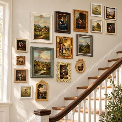
Vintage Frame Collection: this comprehensive set includes 20 carefully curated vintage frames in varying sizes from 10"x8" to 2.5"x2.5", allowing you to display multiple cherished photos in one cohesive gallery arrangement; The package includes all necessary hanging hardware for immediate wall application or tabletop display

Complete Funky Picture Gallery Set: this 8 pieces wavy colorful frame set offers a complete gallery wall solution to transform your space; It includes one 8 x 10 inches frame, two 6 x 6 inches frames, one 4 x 4 inches frame and four 4 x 6 inches frames, allowing you to create an eclectic and fun inspired gallery wall in your living room, bedroom, dining area, or hallway

Durable Material: YESKAY 11x14 picture frames made of MDF wood, stable structure, premium texture, and well-made quality. The HD plexiglass front also protects your treasured photos from damage and keeps them in good shape for years.
How to Use Color to Connect Your Walls
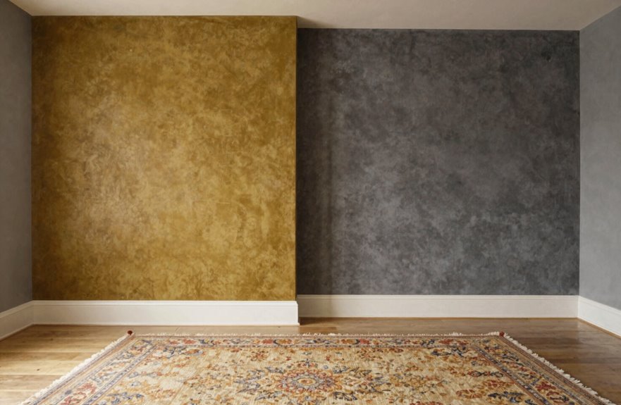
I love how a single color thread can pull a whole room together. When connecting walls, I start by picking one paint color, like Simply White by Benjamin Moore, and let it travel from surface to surface. I shift the mood by going 25% lighter or darker as I move around the room. I’ll hang a moody charcoal accent on the east wall, then ease into soft dove gray by the sofa. This approach creates visual continuity where each wall complements the others instead of competing for attention.

Abstract Ocean Wave Modern Wall Art: This abstract ocean wave wall art creates a calming atmosphere through flowing abstract wall art movement, soft coastal wall decor tones, and modern canvas wall art styling that brings emotional balance into living spaces

Nature Tree Ring Artwork: The 2 piece wall art set featuring close up tree rings in warm beige and natural wood tones arranged across two panels. The design highlights the growth rings, bringing a calm look to your wall. Each panel measures 24 x 36 inches, total is approximately 48 x 36 inches

Organic Botanical Line Art Design: Featuring abstract floral forms with elegant line art details, this artwork blends natural botanical elements with minimalist composition for a modern artistic wall display.
Color Cohesion Principles
When I first started decorating my living room, I threw colors together like a kid with a brand-new paint set. It looked chaotic. I’ve learned that color cohesion isn’t about matching everything perfectly but creating a unifying palette that talks to itself across your walls.
I start by picking one anchor color, maybe Simply White by Benjamin Moore, and build around it. This gives me wall décor balance without everything looking flat. I’ll place my boldest art or a deep navy accent on one focal wall, then keep surrounding walls softer so your eye travels smoothly.
If something clashes, I tweak it. I check that my frames, textiles, and even wood tones feel connected. When your colors flow, the whole room feels cohesive.
Tone Transition Techniques
How do you make one room feel like one single breath instead of a bunch of separate gasps? I use tone transition to weave my walls together.
I pick one undertone, maybe warm gray, and spread it across adjacent walls in slightly different strengths. Wall one gets Behr “Silver Drop” at 75% depth, and wall two catches it at 50%. The color cohesion happens because your eye catches the family resemblance.
I bridge spaces with related hues too. Navy on one wall, slate on the next, charcoal on trim; same family, different personalities. And I always test swatches at 2-foot squares during morning and evening lighting conditions because that gray I loved at noon might turn purple by lamp light.
How to Build a Gallery Wall That Works
Why does building a gallery wall feel so intimidating? I’ve been there, staring at blank walls like they’re judging me. Balance is your best friend, and negative space isn’t empty; it’s rest.
I stick to one or two focal walls and let others breathe. For walls wider than 24 inches, I balance the opposite side so nothing feels lopsided. Mixing wall configurations keeps things interesting. Here’s what works:
- One large statement piece paired with a small gallery wall nearby
- A clean grid on one wall, a loose salon-style cluster on another
- Leaning frames on art ledges for easy swapping
- 3D elements like sconces to break up flat surfaces
Keep your color palette tight, vary your scales, and remember that your home should feel like the space where you belong.

TEXTURED DESIGN:This abstract geometric face framed canvas wall art set features subtle embossed faceted face patterns across the 3 panels with neutral earth tones. Lightly...
How to Fix Over-Decorated Walls
I’ve walked into rooms where every single wall screams for attention, and it’s exhausting. When fixing an over-decorated space, I start by pulling down about 30% of the pieces, yes, actually taking them off the wall, and then I step back to see where my eyes naturally land. Then I grab a 24-inch level and check that my remaining art sits balanced around key features like windows or fireplaces. Once I redistribute that visual weight, the whole room finally breathes again.

Vintage Village Stream Artwork Wall Art: This hanging canvas artwork features a serene stream village forest path inspired by classic etchings. Delicate linework, soft sepia tones, and layered textures capture the pastoral charm of countryside wanderings

Sturdy & Delicate Frames Set: The Fisnish 36 x 48 frame is made of solid wood, ensuring durability and resistance to damage or deformation compared to plastic frames, while perfectly protecting your cherished photos.

HOW TO CHOOSE A PROPER CANVAS FRAME - The listed floater frame size is based on inner dimensions. For example, if your stretched canvas painting is 24x36, then please order the 24x36 frame. The rabbet depth of the painting frame is 1.5 inches. We recommend to use the art frame for 1.2-1.5in canvas prints. Moreover, there is 0.2” gap on each side to create floating effect, beautifully decorating protecting your beloved artwork
Removing Excess Pieces
So you’ve gone a little wild with the hammer and nails, and now your room feels more like a crowded museum than a cozy space you actually want to hang out in. Let’s fix this together and get your balance back.
First, I grab my 3M Command Strips and start pulling down pieces that compete for attention. I look for visual weight overload, when everything screams “look at me” and nothing actually gets seen.
- Remove one piece from every wall that’s crowded
- Pick your favorite wall art and let it shine alone
- Create at least one blank wall for breathing room
- Step back and feel the calm
That quiet wall becomes your room’s best friend.
Rebalancing Visual Weight
Now that I’ve cleared some breathing room, I’m ready to spread the love around and make every wall feel intentional instead of accidental.
I think about visual weight like I’m arranging friends at a dinner table. Everyone needs space to shine. I’ll pick one or two walls for my statement wall decor, maybe a 36×48″ canvas above the sofa, and let negative space do the substantial work elsewhere. This gives your eyes a place to rest.
For balance, I’ll mirror that big piece across the room with a tall floor lamp or sculptural plant stand. In my open living area, I’m dividing the long wall into zones: one large piece here, a small gallery cluster there. I’m treating all walls as one team, making sure my furniture and lighting support the story rather than competing for attention. This creates visual cohesion throughout the space.
How to Know When Your Wall Decor Is Complete
How do you finally know when to put down the hammer and step back? Completion isn’t about filling every inch. It’s about feeling that sigh of relief when you walk in.
What to check:
- Balance: Does one wall scream while others whisper? I offset heavy pieces like my 36″ round mirror with lighter touches across the room.
- Negative space: Leave breathing room. That blank wall by the window is intentional, not empty.
- Scale: My 8-foot ceiling can’t handle tiny 5×7 frames floating alone. I go bigger or group smaller pieces.
- Completion: Step back, squint, and wait a day. If you’re still smiling, you’re done.
Rebalance by staging first. Tape up paper templates, live with it, and adjust. Your walls should feel like home, not a museum.