

I always start with my cabinets, floors, and fixtures first because paint is the cheapest thing to change later. Grab some Samplize peel-and-stick samples and hold them against your actual finishes, not just tiny swatches. I use the ColorSnap Visualizer app to preview colors on my walls before I commit. Match each room’s mood to how you’ll use it: warm and lively for chatting with friends, cool and calm for your bedroom retreat. Connect rooms by keeping one neutral trim color throughout, but vary your wall hues so everything flows without feeling matchy-matchy. Testing colors properly and balancing dark accents creates a home that feels intentional rather than accidental.
Choose Your Paint Last: Let Finishes and Fabrics Lead the Way
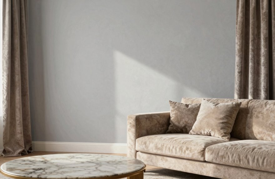
Why do so many of us grab paint swatches first thing? I used to do it too. I’d stand in the paint aisle, convinced I’d found THE color. Then I’d get home and wonder why it clashed with everything.
I started letting finishes lead instead. That vintage rug with the worn terracotta threads. That hand-painted tile in the bathroom. These become my color compass. I look at cabinets, flooring, and fixtures first because they’re staying put. Paint’s the easy part to change.
I grab Peel & Stick samples from Sherwin-Williams and test them right against my actual finishes. The ColorSnap Visualizer app lets me preview before I commit. When I choose wall colors last, color harmony happens naturally. No more repainting rooms that feel off.
Match Paint to Room Purpose and Daily Use
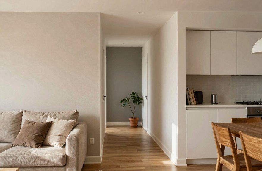
Once I’ve got my finishes sorted and my paint samples in hand, I start thinking about what actually happens in each room. I match color intent to room purpose so my choices actually work for daily life.
Paint isn’t just color—it’s a decision about how you want to live in a space.
Here’s how I do it:
- Define the main activity. Lively talks need energizing hues.
- Picture daily use and mood goals side-by-side with my swatches.
- Pick warmer tones for social spots and cooler neutrals for private retreats.
- Choose lasting comfort over trendy colors that fade fast.
I want my home to feel like me, not a magazine spread. When I visualize how I’ll actually live in each space, the right shades become clear. You know what feels like home.
Connect Rooms Visually Without Forcing a Match
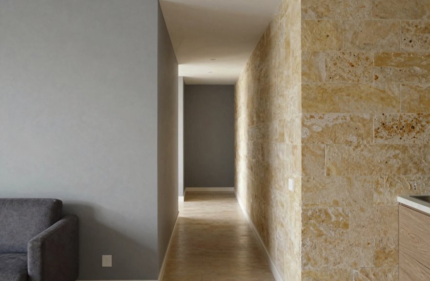
So how do I keep my home from feeling like a disjointed mess without making every room look identical? I use a shared palette with varying hues. This gives me cohesion without boring sameness. I pick one neutral for all trim and doors, and it creates instant visual continuity.
| My Strategy | Why It Works |
|---|---|
| Shared neutral trim | Creates instant visual flow |
| Varying hues, same family | Rooms feel connected but unique |
| Colormix Forecast palettes | No guesswork, just gorgeous coordination |
| Test in actual light | I avoid the “funhouse” clashing nightmare |
I skip colors that are too close or wildly clashing when seen in succession. Instead, I let that neutral palette cleanser breathe between rooms. I test everything in real lighting and adjust as I go. This approach ensures rooms connect visually while maintaining their individual character.
Balance Dark Accents and Light Spaces for Depth
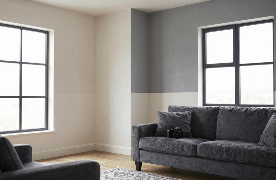
I’ve got my rooms talking to each other now, but I don’t want them whispering. I want drama. Dark colors are my secret weapon for creating depth and making spaces feel grounded. I use them on woodwork or built-ins to break up lighter areas and add dimension. Balance is everything. I’m never painting my ceiling to match deep walls because that feels like a cave. Instead, I grab warm neutrals overhead to keep things open.
Here’s how I nail it:
- Pick ONE dark accent wall per room without overdoing it.
- Pair Behr’s “Black Mocha” on trim with Swiss Coffee ceilings.
- Use deep tones where natural light hits; they practically glow.
- Keep ceilings 2-3 shades lighter than walls minimum.
In my tiny bathroom, I tried this trick: deep navy on the window wall only. This creates an immediate sense of luxury without making the space feel cramped.
Test Colors Thoroughly Before Committing to Whole-House Paint
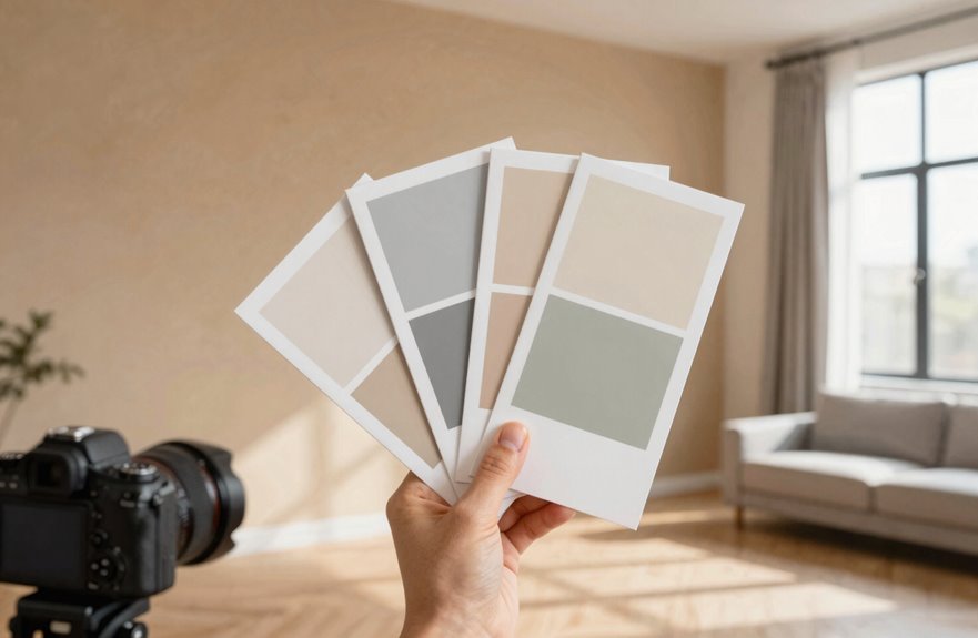
Why guess when you can know? Paint samples save you from expensive mistakes.
Skip the regret—paint samples are your insurance policy against costly color disasters.
I start with 6–8 colors from my chosen family. I grab Samplize peel-and-stick sheets or small paint pots and stick them right on my walls. I use white paper between samples and my finishes so I can really see what’s happening without tricks.
Then I test in space. I score each color 0–10 for how it plays with my floors and cabinets, and I snap photos throughout the day because lighting changes everything. That gray looked perfect at noon but turned muddy by sunset.
Still unsure? I paint two coats on an actual wall with the exact finish. When I’m down to two favorites, I buy quart-sized samples and create big patches side by side. This approach eliminates surprises when selecting your final color.